Student centered.
With the addition of the new Norman and Evangeline Hagfors Center for Science, Business and Religion, Augsburg University takes its commitment to diversity and inclusion to a new level. It is home to a diverse student body and the largest conference on workplace inclusion and equity, making it an ideal place for nearly 3,400 students to pursue degrees in the heart of Minneapolis.
Designed to foster interdisciplinary learning and connect the University to the community, Hagfors Center embodies Augsburg’s commitment to student learning, urban placemaking, and thoughtful stewardship.
Built for the future.
The Center will be the catalyst for expressing the University’s aspirations for a 21st century urban campus. Connected to the institution’s core identity of deep traditions, durable faith, and inclusive and experiential learning, these guiding principles were important structural standpoints for the project.
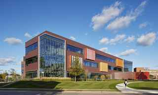
The four-story academic building integrates classroom, laboratory, and research facilities for eight departments (biology, business, chemistry, computer science, math, physics, psychology, and religion) that serve more than 2,500 students. Classrooms and labs have the flexibility to reconfigure, enabling an active, experiential learning process, with both teaching and learning formats.
The casual spaces foster interdisciplinary and collaborative learning while outdoor spaces, such as the community gardens, create teaching environments and opportunities for community engagement.

Think green.
Sustainability and environmental design were at top concern for the designers of the Hagfors Center, which includes energy-efficient systems, recycled materials, low VOC emitting components, high-tech controllable lighting, low-flow plumbing fixtures, storm-water control, and partial green roof. With all of these green attributes combined, the building is targeting LEED Silver certification.
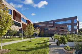
In addition to the Center's many green features, the location was also strategically selected to open up green space on campus. After the existing Science Hall was removed, the central green space stretches from the rain garden near the Hagfors Center entrance, through the heart of campus — past Old Main, Christensen Center, and Memorial Hall — to Murphy Square and Edor Nelson Field anchoring the east side of campus. This allows for the Center to welcome the neighborhood with an “open arms” design facing the adjacent residential community and embracing the community gardens.
Student centered.
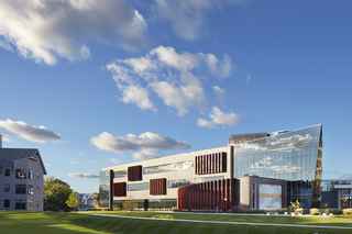
The design of the Center is based on a chevron plan that emphasizes the intersection between the scientific, business, and religious disciplines housed in the building. At the center of the intersection is a glass-walled, three-story learning commons that serves as the social and academic heart of the building. A small suspended chapel on the third floor completes the top of this space.
Three full stories (and one partial fourth story) of classrooms, offices, and laboratories are efficiently organized to take advantage of natural light, respond to flexible laboratory planning needs, and offer flexibility for active learning classrooms.
The intention behind this learning center is to encourage collaboration among branches of academia. Above all, the building is student-centered; everything about it is meant to support learning experiences – from the formal to informal spaces.
Augsburg is one of the most thoughtful, reflective partners that we’ve ever had.
The overarching design goals to integrate the architecturally-exposed structural system along the perimeter of the building in conjunction with the architectural precast exterior spandrel panels created unique design, engineering and execution challenges for the Architect, Engineer of Record and Precast Concrete Producer to solve prior to construction. The partnership formed during early design phases between these project members was critical to the overall success of the interior and exterior aesthetic.
The Wells advantage.
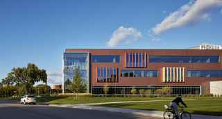
The exterior of the building features a background of brick and glass ribbon windows, punctuated by “bay windows” that correlate to areas of collaboration inside the building. The bay windows are detailed with colored mullion extensions that emphasize the various disciplines brought together in the building and respond to the diversity of the campus and its surrounding neighborhood.
The exterior façade features Endicott thin brick embedded in precast concrete to provide the visual appeal of traditional masonry with the durability and economy of precast. Wells provided 294 pieces of 10 1/2″ insulated precast panels with cast in Versa-Brix® 3D thin brick inlay system from Architectural Polymers.
The project broke ground in April 2016 and opened January 2018 as planned.

Design challenges.
The design team, knowing the uniqueness of the structure, included the precast team early on into the weekly design meetings. This collaboration allowed us to take advantage of customizing the precast. The open lines of communication resulted in many creative and unique features for the project.
Some of this collaboration included a tour, in which the entire design team visited the producer’s plant and mock-up samples to obtain a better understanding of the production process and capabilities of the producer. This enabled our team to embrace the concept that whatever they imagined, could be recreated in precast concrete to make stunning, iconic façades.
As the team was going through the design process, it was discovered that the cantilever portions of the cast-in-place floors would interfere with the installation of the precast pieces. The solution was to cast the floors without the cantilever, make them out of precast and weld them on to the edge of the deck as the precast cladding went up. This allowed the design to be more creative with the size and shape.
The interior finishes allowed only 4 inches for the precast to connect to the structure. If they projected more than 4 inches onto the structure, they would then be exposed, which was undesirable. Wells developed a solution by using unique steel shapes and weld sizes to connect the precast to the structure. There were also exposed connections in the stairs that required special design consideration to meet aesthetic requirements.
The main entrance included an interior precast soffit with the same thin brick and pattern as the exterior. This piece hung from a structural steel frame above and was installed using special forklifts. Special thin brick shapes were used to create the 130 degree building corner at the main entry.
Even with this special angulating brick, Wells was able to match the mortar joint color, texture and shape of the field-set brick.
The number of different window sizes led to thin precast shapes and challenges with designing the precast to handle the wind load requirements. Special connections spaced at 48 inches on center were used in each panel to handle these lateral load requirements.
Check out PCI Midwest's featured video on this project here.


